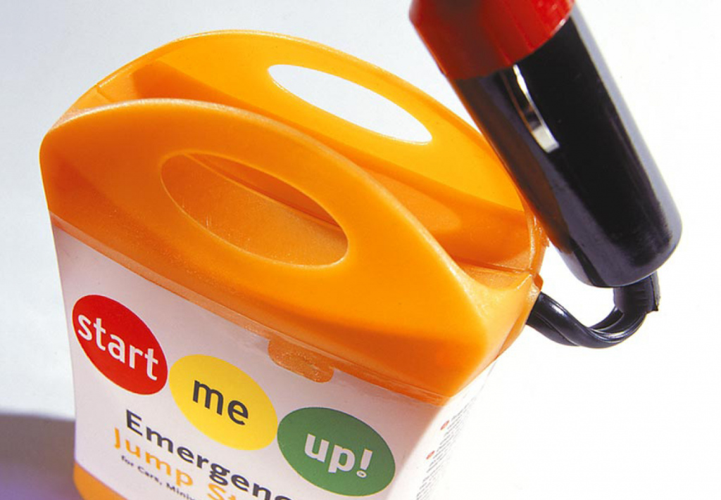
If a picture speaks a thousand words, how much is the packaging of a product that people actually pay for worth? That’s a question Fritz Klaetke, one of our contributors for the book, can answer. No matter if you’re a small or large company, if you sell products, the packaging is key.

“…packaging–and design as a whole–has a huge impact on how your audience reacts,” explains Klaetke, who is Principal and Design Director for Visual Dialogue, “And a small business can present itself and its products just as well (or better) than a huge conglomerate through great packaging.”
Four of the projects Klaetke’s firm has worked on were featured in the book: packaging design for StartMeUp Emergency Jump Starter, website design for Schwilliamz, website design for Topic101, and website and marketing material for Process. Package design is close to his heart: “The design of a product’s packaging is often the first thing a potential customer encounters. Their first impression of a product, a company, a brand happens at that moment (and you know the old saying about 1st impressions and 2nd chances).”
But good design alone isn’t enough for success, says Klaetke. You can have the best packaging in the world, but if your product sucks, well, you won’t make many sales. And if the formula is flipped and you have a fantastic product but bad packaging design, your product will sit on the shelf gathering dust.
Packaging Design for Small Business
Even small businesses can afford good packaging design (and it’s a worthy investment, so don’t skimp). Klaetke says the key is to start with a product that’s worth packaging. He also says it’s important to stand out from the competition: “T
He also stresses the importance of reflecting your audience’s needs, wants and values. Packaging should speak to them, the way the StartMeUp packaging now appeals to an audience beyond guys who work on their cars.

