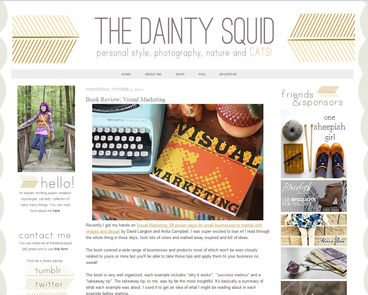
The reviews of Visual Marketing are starting to come in, and we’re really excited about what people have to say about the book. We thought we’d share what people are saying, as well as what we’ve learned from the first reviews.

Kaylah on The Dainty Squid (love the name) was inspired in what she found in our book (and for good reason! Our 99 case studies know their design). Thank you, Kaylah, for taking such beautiful photos of the book. They’re exactly in line with what we call VizThink (using visual imagery to enhance a blog post, ad, website, etc).
Angie from The Work at Home Wife thought that most of the examples in the book were great for solopreneurs to put into play, although a few she thought would require more tech experience than some entrepreneurs have. Point taken. We tried to include a wide range of examples, and naturally, some will require more tech knowledge, design experience, et cetera, than others.
We also received a video review by Denise O’Berry (thanks Denise, for taking the time!). She calls our book “thick and meaty,” which, if you like steak, is a great compliment for a book! She does a fantastic job of pointing out specific examples, page numbers and all.
What We Learned
Some of the reviews pointed out the fact that a book about design shouldn’t be in black and white.
We understand. Naturally we would have loved to have full color for the book, but then the cost would have gone up significantly. There is one advantage, though, to black and white. It helps focus more on some of the graphical elements we want to highlight when the color is stripped away.
Visual Marketing is designed to provide inspiration, and get your creative juices flowing. We want you to use the case studies as a springboard to your own creativity.

