The eyes might be the window to your soul, but your business card is the window to your company. If it’s stuffy, unprofessional or plain ugly, it reflects on how people see your business. Visual Marketing contributor Katrina Hase of Mix Creative has seen more than her fair share of business cards that didn’t do the businesses justice. And that’s silly, simply because it doesn’t take that much to stand out. Hase says:
One thing that I’ve discovered with my clients, and among the small business owners I network with, is that they’ll spend all kinds of money on the tools they need for their business—on sales coaches, seminars, networking events and even designers like me—but when it comes to printing their marketing collateral, they’ll go with the least expensive printing and paper options time and again. Sometimes the simplest way to stand out is to spend the money on a thicker card stock than your competitors, adding a spot varnish, selecting a unique and memorable paper, adding a die cut, or printing them with a pure Pantone color or with letterpress.
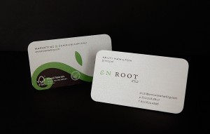
Think about the business cards you’ve remarked on upon receiving. Something about them stood out to you: be it the color, shape or texture. A simple tweak to your card can make you more memorable to the people you meet. Here’s a sample of an appealing card Hase has designed:
Hase says many businesses spend a lot up front on brand identity, but then dwindle down their budgets over time for marketing materials, making their business cards the last thing they focus on. But even if you go DIY, there’s no reason to design a bland card. Her tips for creating a memorable business card center around simplicity and uniqueness:
- Keep it short and sweet. Question how much information is REALLY necessary to include on your card, knowing that most people can visit your website for information.
- Use both sides of the card. I often use the back side of the card as a sort of ad space: it’s a great place for a tagline, web address, or bulleted list of products/services (no more than 3, please!)
- Look at cards you like: what do you notice? Chances are they’re doing something more than all center-justified type in capital letters.
- Leave a generous amount of white space. It serves two purposes: to show that you’re not the type of person to try to get in every word in every conversation, AND it leaves room for the recipient to write down a little note about how they met you.


Circle business cards ar really distinctive and may bring an attention-grabbing look to any example for your business or personal functions. They need no spherical edges giving these business cards a better sturdiness and last longer.