Beefing Up Your Professional Headshot

Michelle Villalobos loves Sharpies. She uses them to draw charts and enhance her visual presentations on branding. But she didn’t know exactly how big a role these markers would play in her business until she had professional headshots taken.

Villalobos took a few headshots with a span of Sharpies spread out in front of her. She didn’t take the shot seriously until she saw how it resonated with her clients. Now it’s her trademark: “It has become a major piece of my visual brand,” says Villalobos, “So much so that as I follow my own advice and periodically get updated shots, I’m not able to do away with that picture altogether – people are just too attached to it, and it has too much brand equity to let it go altogether. So now I mix it up with other pictures in order to “ease” them into the transition.”

We featured Villalobos in Visual Marketing because of her unique approach to the professional headshot. Most headshots, says Villalobos, are stale and cookie-cutter. “Most of the time the photographer chooses the poses – and photographers don’t necessarily understand the strategic branding initiatives that a head shot contributes to and furthers. It is important for the subject to decide how he or she wants to be portrayed everywhere: on their website, in social media profiles, on media kits and on the web at large, and then communicate that to the photographer early, and develop a plan for executing that.”

Go Beyond the Traditional Headshot

Villalobos encourages all business owners to have a professional photographer take headshots for their website and social media profiles. But don’t let the photographer lead how you represent yourself.

“Give some real thought to your personal brand, and how you’d like the world to see you, talk to your photographer about that and brainstorm ways you can get that across visually,” explains Villalobos, “For example, an attorney client of mine was really struggling because he wanted something “professional” (i.e., wearing the traditional suit) but at the same time accessible and something that shows how hard he works. So we showed him with his tie on, jacket off, standing with his foot on a stack of books. He loves this picture – and so do his clients.”

Remember that while the photographer is the expert at taking pictures, you’re the expert at your brand and how you want to be portrayed. Make sure the headshots reflect who you want people to see.

How to Stand Out in an Attention Economy

So many small businesses do a poor job of marketing their services. They either think they can’t afford truly innovative campaigns, or they go with the flow and do what everyone else does. Either way, you don’t get the attention you wanted.

Brand design consultants DAAKE were determined to stand out in what Principal/Creative Director Greg Daake calls an “attention economy” with its own branding: “The goal is to get someone’s attention,” Daake says, “You can’t play the same note on a flute as everyone else is playing and expect to get heard. Instead bring a cowbell to the concert.”

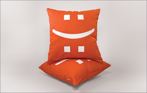
DAAKE was featured in Visual Marketing for its unique approach to getting the attention of potential customers. Rather than sending a traditional piece of direct mail, which Daake says people won’t remember, the company instead sent bright orange pillows with emoticons for “happy” and “sad.” Who wouldn’t notice getting a fun pillow in the mail?

Color as a Strategy

The pillows could have been blue. Or multicolored. But there was a strategy in choosing orange, says Daake: “We’ve found that we can own the color orange and we insist that it’s the one thing our pieces will scream to the viewer. At the very least, associations can be made between that color and us.”

And as to why the company chose pillows rather than pens or other traditional tschotchkes, the company wanted to signify comfort, and give recipients something they would actually keep. To create further engagement with the 100 contacts DAAKE sent the pillows to, the company followed up with a short video showing the pillow having its own adventures. Sure beats that coupon I got in the mail today!

Don’t Just Get Out of the Box–Burn the Box Entirely

Daake encourages small businesses to think creatively when it comes to branding. “…do the opposite of everyone else,” he says, “Do something that is completely strange or innovative – at the very least different. If other people are [doing] 8.5 x 11, do an odd size. If other people are sending postcards – send cupcakes.”

Daake says that overnight successes are the stuff of myths. He says rather than aiming to be a flash in the pan, you’d do better to commit to building a reputation and never compromising it.

“The best way is to relentless trudge through the ups and downs sticking to the path you believe in. That will attract the right kinds of customers/clients.”

Packaging Design Speaks a Thousand Words

If a picture speaks a thousand words, how much is the packaging of a product that people actually pay for worth? That’s a question Fritz Klaetke, one of our contributors for the book, can answer. No matter if you’re a small or large company, if you sell products, the packaging is key.

“…packaging–and design as a whole–has a huge impact on how your audience reacts,” explains Klaetke, who is Principal and Design Director for Visual Dialogue, “And a small business can present itself and its products just as well (or better) than a huge conglomerate through great packaging.”

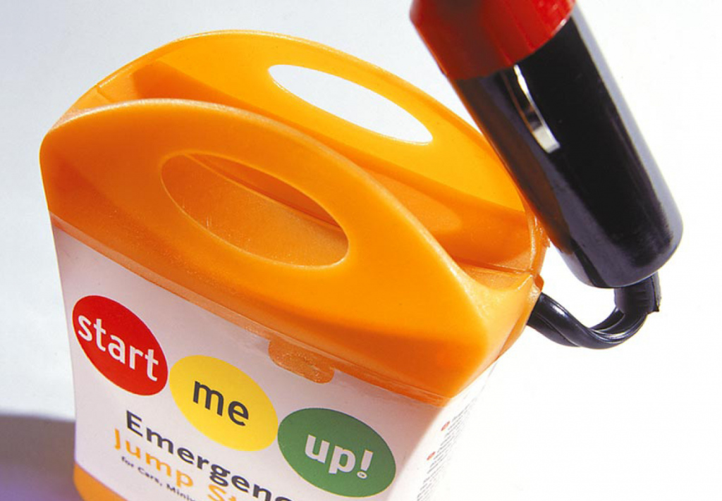
Four of the projects Klaetke’s firm has worked on were featured in the book: packaging design for StartMeUp Emergency Jump Starter, website design for Schwilliamz, website design for Topic101, and website and marketing material for Process. Package design is close to his heart: “The design of a product’s packaging is often the first thing a potential customer encounters. Their first impression of a product, a company, a brand happens at that moment (and you know the old saying about 1st impressions and 2nd chances).”

But good design alone isn’t enough for success, says Klaetke. You can have the best packaging in the world, but if your product sucks, well, you won’t make many sales. And if the formula is flipped and you have a fantastic product but bad packaging design, your product will sit on the shelf gathering dust.

Packaging Design for Small Business

Even small businesses can afford good packaging design (and it’s a worthy investment, so don’t skimp). Klaetke says the key is to start with a product that’s worth packaging. He also says it’s important to stand out from the competition: “T

he trick here is to be distinctive and eye-catching–doing what the others don’t–while still reflecting the brand/product’s key messages.”
He uses the
StartMeUp emergency jumpstart kit featured in the book as an example: “when we looked at other automotive products they all had “car-guy graphics”–lightning bolts and black and red and checkered flags and metallic effects. We went the opposite direction with a clean, minimal package to stand out in and reinforce the “easy as 1-2-3″ message.”

He also stresses the importance of reflecting your audience’s needs, wants and values. Packaging should speak to them, the way the StartMeUp packaging now appeals to an audience beyond guys who work on their cars.